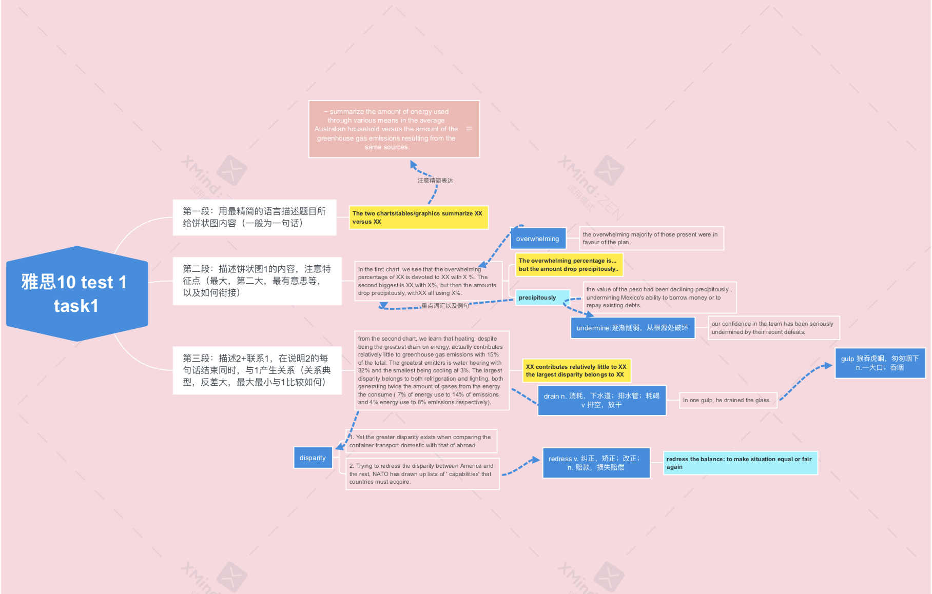
小作文
1
题目
- The first chart below shows how energy is used in an average Australian household. The second chart shows the greenhouse gas emissions which result from this energy use.


范文
The two charts summarise the amount of energy used through various means in the average Australian household versus the amount of greenhouse gas emissions resulting from the same sources.
In the first chart, we see that the overwhelming percentage of energy is devoted to household heating, with 42% of total energy usage. The second biggest is water heating with 30%, but then the amounts drop precipitously, with other appliances, refrigeration, lighting and cooling all using 28%.
From the second chart, we learn that heating, despite being the greatest drain on energy, actually contributes relatively little to greenhouse gas emissions with 15% of the total. The greatest emitter is water heating with 32% and the smallest being cooling at 3%. The largest disparity belongs to both refrigeration and lighting, both generating twice the amount of gases from the energy they consume (7% of energy use to 14% of emissions and 4% energy use to 8% of emissions respectively).
The pie charts reveal the amounts of energy used for domestic needs in Australia along with the percents of the concomitant emissions yielded on account of using energy.
Taking a look at the first chart, heating is the integral source of energy usage, accounting for 42% of the energy use. Following that, water heating and other appliances are the chief matters for energy consumption with 30% and 15% energy usage respectively. Moreover, refrigeration, lighting, and cooling have the least shares of consumption with 7%, 4%, and 2% energy usage respectively.
Moving to the second chart, in terms of generating emissions, water heating is at the top of the list, constituting 32% of the emissions. Thence, other appliances and heating are responsible for 28% and 15% of the emissions, and they are followed by refrigeration (14%) and lighting (8%). Interestingly, not only does cooling have the least amount of energy usage, but also it causes the tiniest emission in contrast to its counterparts.
To sum up, warming up is the most prominent matter, in terms of both energy consumption and generating pollution.
2
题目
The charts below show the proportions of British students at one university in England who were able to speak other languages in addition to English, in2000 and 2010.
Summarise the information by selecting and reporting the main features,and make comparisons where relevant.

我的
The two charts illustrate the percetages of one British university students who had the ability of speaking foreign languages in 2000 versus the percentages in 2010.
From the first chart, we can see the percentages of students who can speak only mother language in 2000 is 30%, while the percentages of students who can speaking other languages occupys 70% of the total, which the details of is “French only” with %15, “German only” with %10, “Spanish only” with %20, “Another language” with 15, and “Two other languages” with 10.
Moving to the second chart, the percentage of students who can not speaking other language in 2010 had increased 5 percent compared with the percentage in 2000. Besides, the amouts of students who were able to speak German had droped from 20% in 2000 to 10% in 2010. However, there were both 5 percent increasement in the pecentages of “Another language” and “Two othe luanguage”.
To sum up, the amount of British students in this University who can speak foreign language had decreased in total, while the students who were able to speak more than one foreign language and the students who had the ability of speaking another languages other than English, French, German, and Spanish had became more and more.
建议
- 尽量把图表的类型写出来
- 总体趋势, 再跟一句总体趋势 范文第二自然段 是不是有一个overall 英文和中文不一样 要直入主题 英文要总分形式 一般保分就是总分
- 表示第一个表格30 和70都说没有必要,一个是三十另一个不就是70 了嘛,而且没有体现表格的重要特征,只摆了数据
- 第二段思路还可以,语言要更加地道 多看范文 再写一篇 同样一篇 你的逻辑多写几遍就懂了
- 抓特征点我指的是你要点出来哪个是最大的那个是最小的
- 主要是你的语句还有进步空间 你看看范文 学习一下连词的正确用法
@by YJ
修改后
The two pie charts illustrate the percetages of one British university students who had the ability of speaking foreign languages in 2000 versus the percentages in 2010.
Overall, the amount of British students in this University who can speak foreign language had decreased in total, while the students who were able to speak more than one foreign language and the students who had the ability of speaking another languages other than English, French, German, and Spanish had became more and more.
From the first chart, we can see the percentages of students who can speak only mother tongue in 2000 is 30%. And the students were able to speak Spanish with 20%, followed by the numbles of students being able to speak French only and another language were similar with 15 percent. Similarly, there were 10% proportions occupied in the German only aspect and the two other language aspect.
Moving to the second chart, the percentage of students who can not speaking other language in 2010 had increased 5 percent compared with the percentage in 2000. Besides, the amounts of students who were able to speak German had dropped 10% from 2000 to 2010. However, there were similarly 5 percent increasement in both “Another language” and “Two othe luanguage”.
意见
- 第二段用过去式
- 第二段表达趋势过长
- 第二段表达整体趋势,后面两端抓取特征进行描述
- 第二段要选趋势变化最大的,要选一个划分点, 例如这里就是一个only mother tongue 和 other language
- 统一表达,10% 和 10 percent
- 抓特征点:!!!!
范文
Given are the pie charts illustrating the percentages of British students knowing other languages apart from English in 2000 and 2010.
Overall, there was an increase in percentage of students who speak only English, while the percentage decreased significantly in the Spanish speakers group.
To begin with, in 2000, 30% of British students in one university were able to speak only their mother tongue, followed by students being able to speak Spanish with 20%. There were similar numbers in the figures of French only and another language with 15 percent. Similarly, 10% proportions were taken in the German only aspect and the two other languages aspect.
Despite the high percentage of respondents who were speaking Spanish in 2000, there was a drop of 10% in 2010, changing the Spanish only figure to be 10%, which was having an identical number with the German only figure and the French only figure. Conversely, there are a rise of 15% in the Another language figure and the percentage of trilingual group in 2010.